
Cryptocurrency App
My Role
As the UI/UX designer, I led the redesign of a cryptocurrency wallet app to improve usability and trustworthiness.
The app originally suffered from poor information architecture and a cluttered interface, making asset management difficult for users.
My role included auditing the existing app, defining a new structure, designing high-fidelity wireframes and mockups, and delivering a dark-themed UI with clear data visualization, ensuring a user-friendly and professional experience.
Project Overview
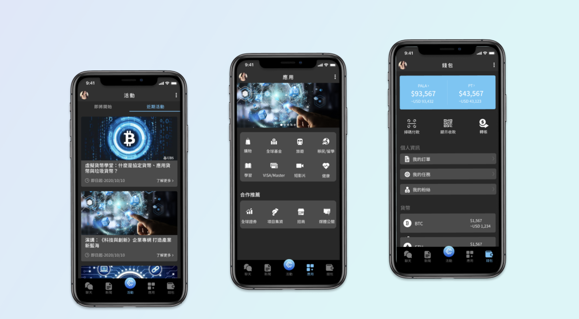
This redesign focuses on improving the usability and visual clarity of a cryptocurrency wallet app.
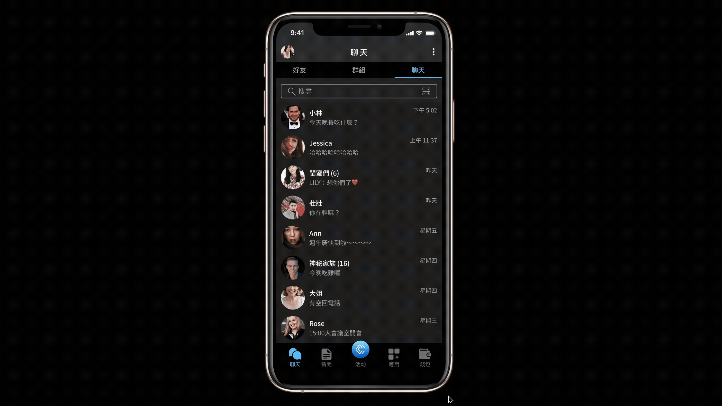
The dark-themed interface uses high-contrast typography and icons to enhance readability.
Real-time asset summaries and intuitive layouts help users of all levels manage their digital assets efficiently.
Design Challenge
The original interface of the cryptocurrency wallet app presented several usability issues. Its complex structure lacked a clear information architecture, making it difficult for users to locate essential features despite the app’s rich functionality. New users faced a steep learning curve due to the unintuitive navigation and overwhelming interface. Additionally, the visual design lacked appeal and professionalism, which weakened user trust. The absence of a clear asset overview and real-time data display further hindered efficient financial management, especially for users needing quick insights into their holdings.
Design Solution
To improve the user experience, I began by reorganizing the app’s content into a clearer structure, grouping key features under intuitive categories such as “Events,” “Applications,” and “Wallet.” This helped users navigate more efficiently and understand the app’s functionalities at a glance. I redesigned the homepage to display real-time asset information with clear segmentation, enabling users to assess their financial status quickly. A dark-themed interface with high-contrast typography and icons was introduced to enhance readability and support extended use, particularly in low-light environments. To guide users through common actions, I incorporated clear entry points, recognizable icons, and prominent call-to-action buttons such as “Transfer” and “View Details.” Visually, the refined layout and modern graphic elements elevated the app’s professionalism, fostering greater user trust and engagement.
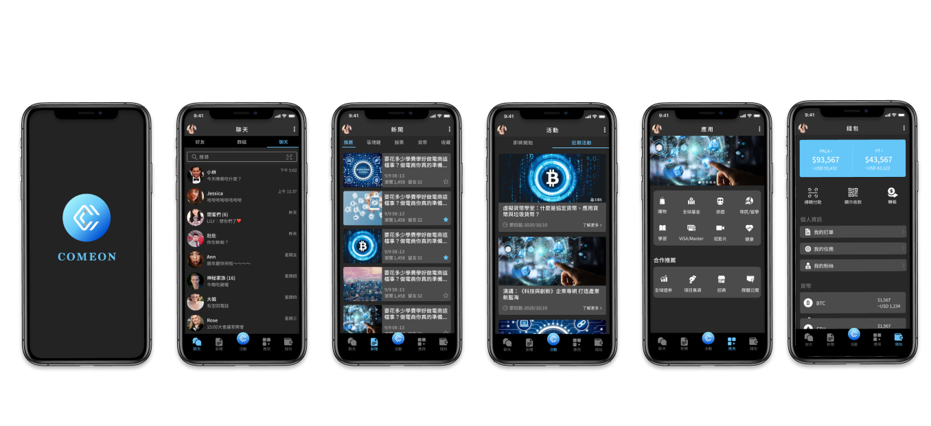
Prototype
Categories
UI/UX Design
Created Date
November ,2020